What Are Candlestick Charts? A Beginner’s Guide
What Is a Candlestick Chart?
A candlestick chart is a type of financial chart used to show price movements of assets like stocks, forex, or cryptocurrencies. Each “candlestick” represents the price action for a specific time period, such as one day, one hour, or even one minute. These charts are popular because they’re easy to read and provide valuable insights into market trends.
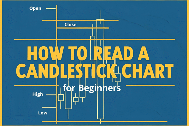
Each candlestick shows four key pieces of information:
- Open: The price at the start of the time period.
- Close: The price at the end of the time period.
- High: The highest price during the period.
- Low: The lowest price during the period.
Visual: Insert a labeled diagram of a single candlestick showing open, close, high, and low. (Alt text: “Diagram of a candlestick chart for beginners”)
A Brief History of Candlestick Charts
Candlestick charts originated in Japan over 300 years ago. A rice trader named Munehisa Homma used them to track price movements in the rice market. His methods evolved into the candlestick charting system we use today. In the 1990s, Western traders adopted these charts, and they’ve since become a standard tool in trading.
Why does this matter? Understanding the history shows that candlestick charts have stood the test of time. They’re a proven way to analyze markets, even for beginners!
Why Are Candlestick Charts Useful for Beginners?
Candlestick charts are beginner-friendly for several reasons:
- Visual Clarity: They make it easy to spot price trends and patterns.
- Versatility: You can use them for stocks, forex, crypto, or any market.
- Pattern Recognition: Candlesticks form patterns (like doji or hammer) that signal potential price movements.
For example, a single candlestick can tell you if buyers or sellers were in control during a time period. Over time, you’ll learn to spot patterns that help you make smarter trading decisions.
Internal Link: Want to learn more about specific patterns? Check out our guide on Top 5 Candlestick Patterns for Beginners.
How Do Candlestick Charts Work?
Each candlestick has a “body” and “wicks” (or shadows):
- The body shows the range between the open and close prices.
- The wicks show the high and low prices.
If the close is higher than the open, the candlestick is usually green (bullish), meaning the price went up. If the close is lower, it’s red (bearish), meaning the price went down.
Visual: Include a chart with bullish and bearish candlesticks. (Alt text: “Bullish and bearish candlestick chart example”)
Getting Started with Candlestick Charts
Ready to try candlestick charts? Here’s how to begin:
- Choose a Platform: Use free tools like TradingView to view candlestick charts.
- Pick a Timeframe: Start with daily charts to keep things simple.
- Practice: Look at historical charts to get familiar with how prices move.
Don’t worry about mastering everything at once. Start by understanding the basics, and you’ll build confidence over time.
Why Candlestick Charts Are Your First Step in Trading
Candlestick charts are like a roadmap for traders. They help you understand what’s happening in the market and make informed decisions. As a beginner, learning candlesticks is a great way to start your trading journey without feeling overwhelmed.
Ready for the next step? Learn How to Read a Candlestick Chart for Beginners to dive deeper.